
One of our biggest goals in developing a theme is for it to look good on all screen and device sizes. In addition to the size of their browser, visitors also have control over their base font size. Keeping this in mind, it is best to use unit measurements that are flexible.
The two most popular units are em and rem. These unit types are based on the font-size. A rem is calculated based on the root font-size (the font-size set on the HTML element). An em is a compound unit type that gets its size based on its containing element(s).
Winning The Lottery
We recently completed work on some updates to a lottery website. The client requested cards built to display information about each of the number-draw games they offer. The layout of the cards needed to be the same across various screen-sizes.
The theme was built using mobile-first principles. In order for the card to display at our smallest targeted screen size (320px), the size of the card would need to be a bit smaller than other viewport sizes to start and then grow from there. In order to ensure that the dimensions of the card would scale properly based on different screen sizes, all sizes for card elements were set using em units.
The theme we were updating had preset breakpoints at 660px and 1020px. Our initial font-size for this section of the page is set to .875em (14px).
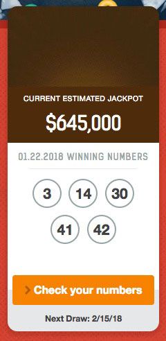
At 660px, we made a few minor changes to the winnings-title class and also upped the font-size for the section to 1.125em (18px) so that it better fit the 2-across layout.
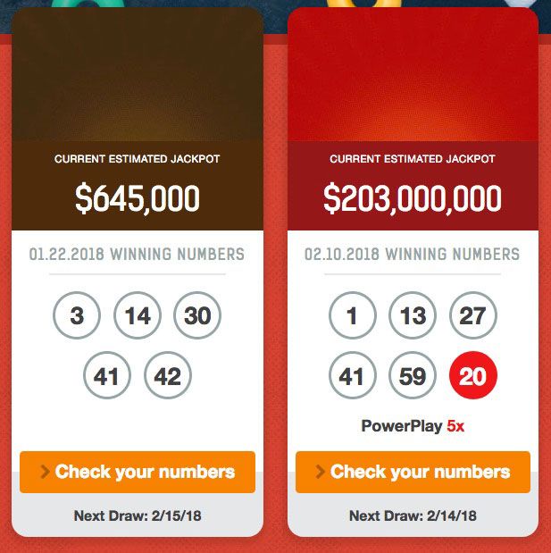
At 1020px, we set the font-size for the section to a standard 1em (16px) to best fit the 4-across layout.

As seen in the screenshots, using em units to set all font-size, margin, padding, and borders, allows the cards to look exactly the same across all screen sizes, even with adjustments to the font-size. Using em units also accomodates situations where a visitor has a different default font-size set in their browser.
The Locals Bureau
Another recent project was a full theme build. This particular theme design had a hero image on the home page with a message.
As the viewport size increased, the font-size of the message also needed to increase. However, there needed to be a max-width on the paragraph to keep it consistent with the design.
By using em units for the font-size, we were able to increase the font at the different breakpoints. By using rem units for the width, we were able to keep the paragraph limited to a fixed width that didn’t adjust each time the font-size increased.

